Work featured in a Dezeen article on Swinburne's School of Design, read it here
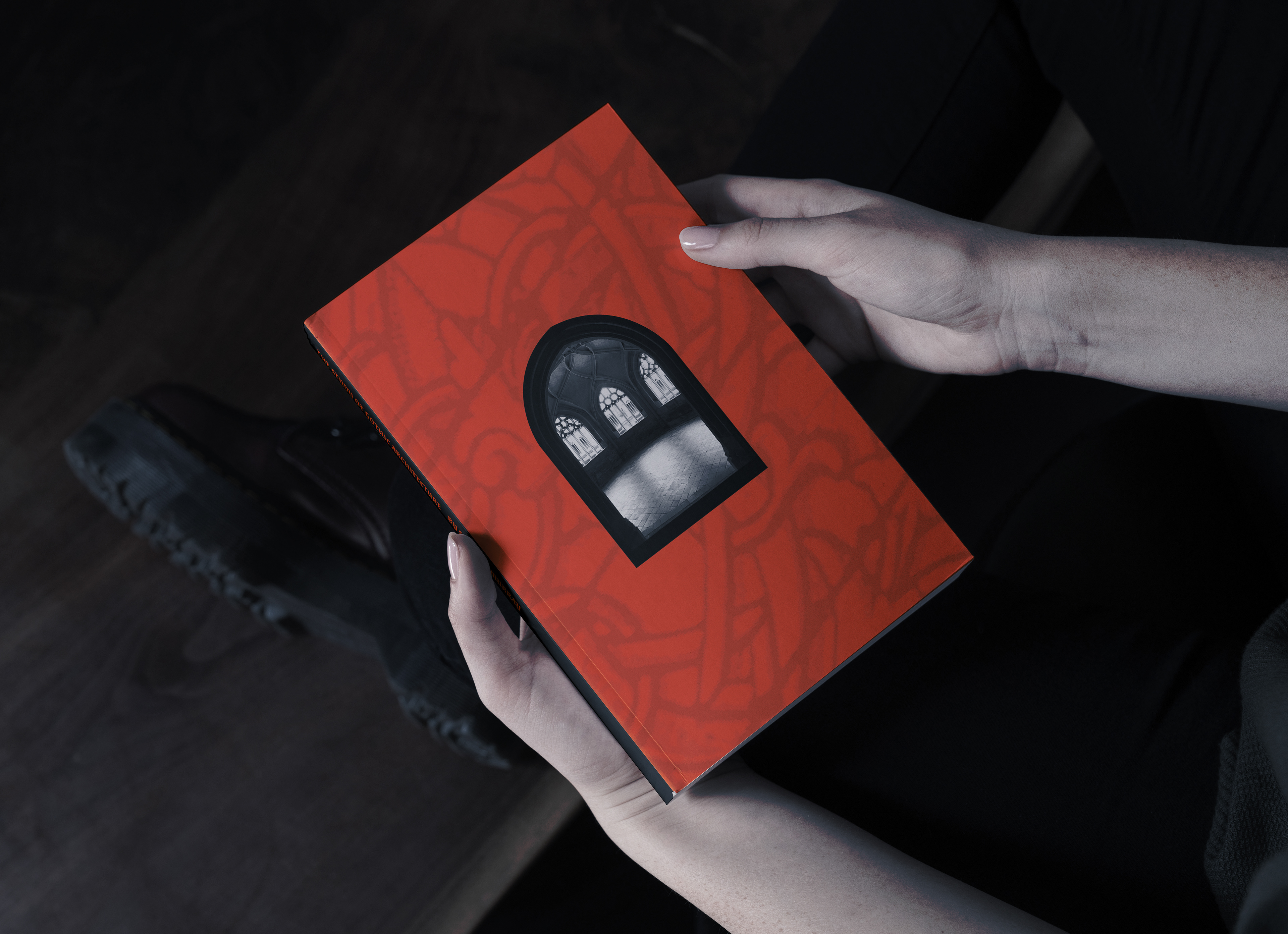
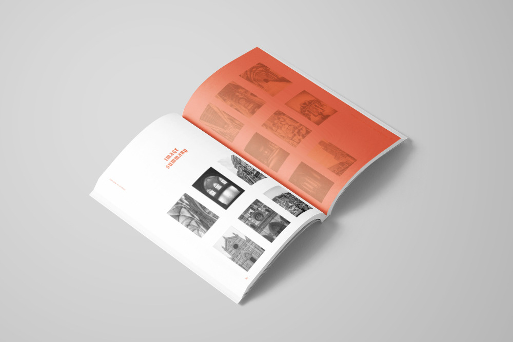
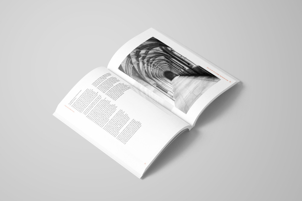
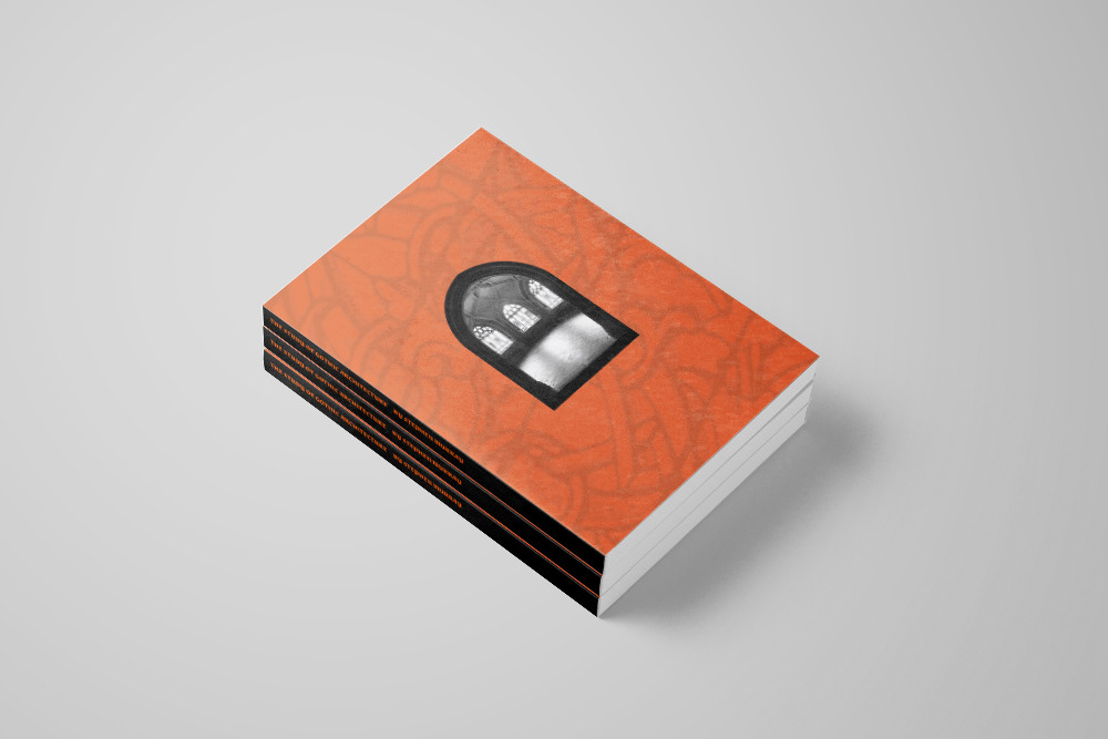
Created during my Bachelor of Design at Swinburne University, this mono-thematic, 42-page publication was an exciting document to design. Being able to choose my subject matter meant I was passionate and interested in the content I was communicating; Gothic Architecture.
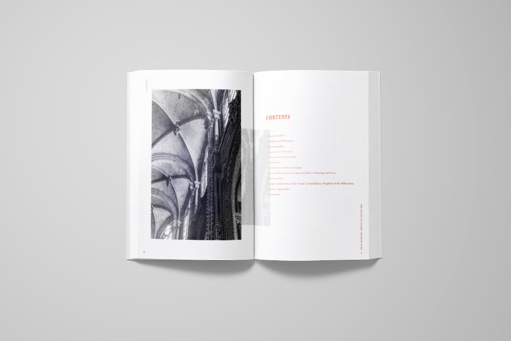
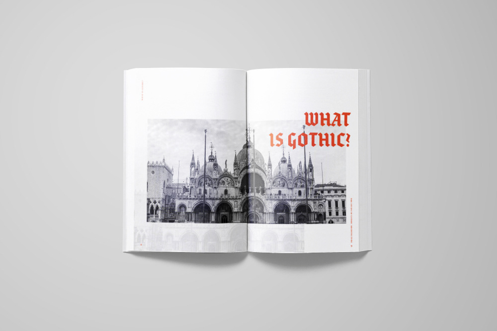
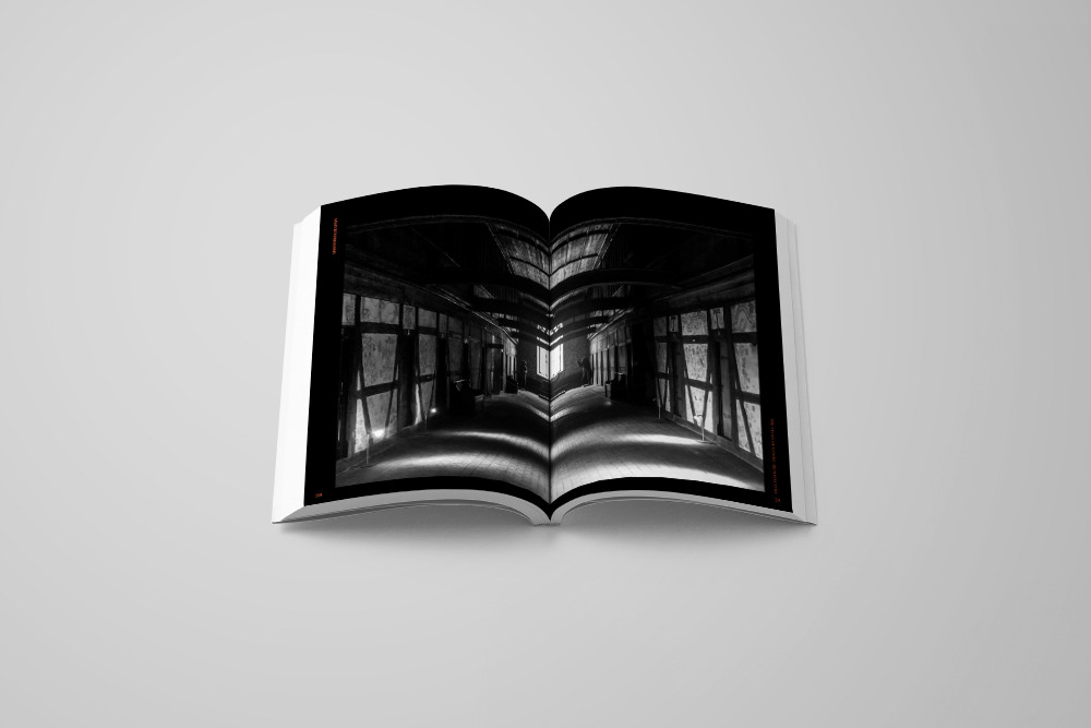
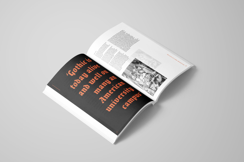
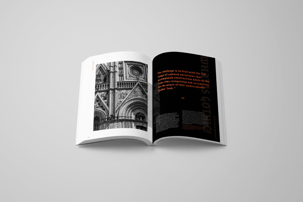
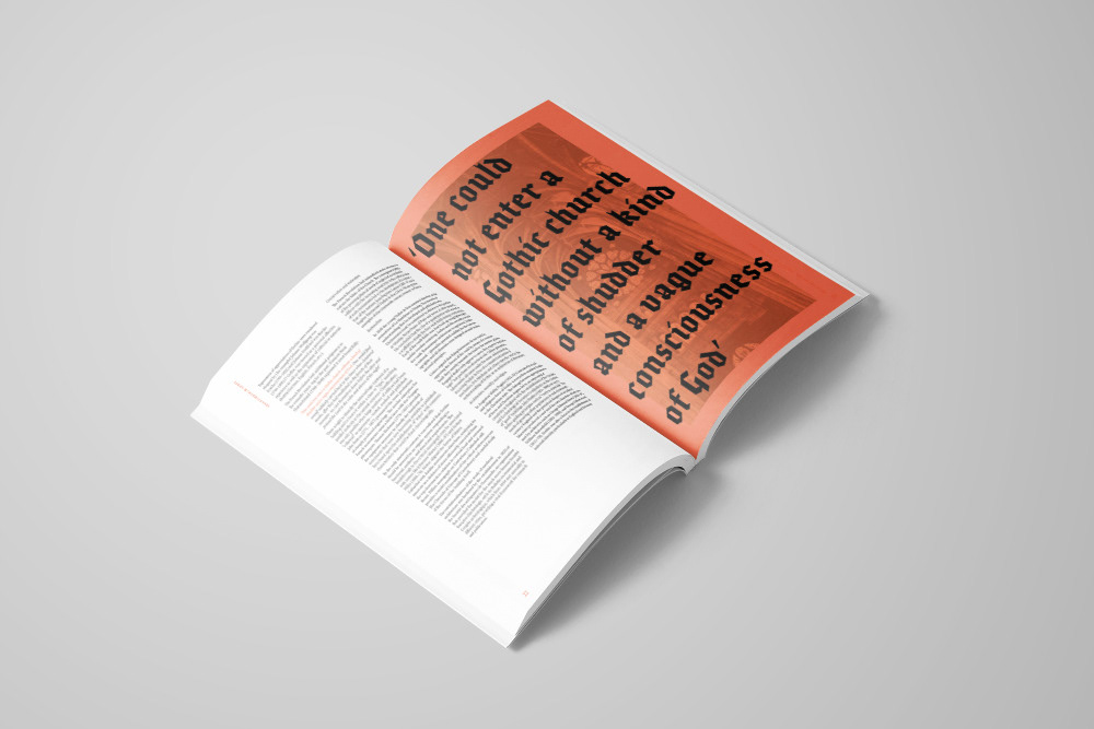
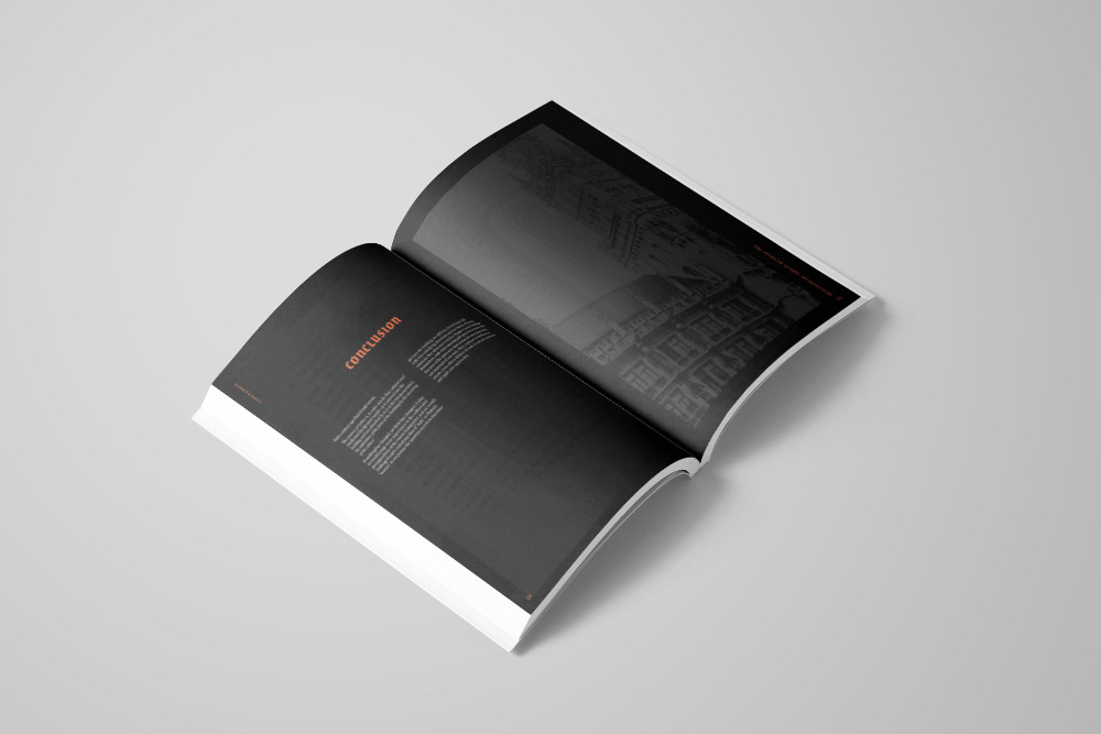
Using my own photography from my time in Europe in 2018, I carefully focused on effectively linking image and typography, as well as creating balance across document spreads. In this publication, I vigilantly considered the consistency and flow throughout the document, ensuring similar layout themes, image treatments and text sizes were seen on numerous occasions.
I also strived to experiment with communicating the subject matter of ‘Gothic Architecture’ in an unconventional and modern way, whilst still linking to the contents historical and traditional ties. In order to do this, I used a distinctly traditional style ‘Gothic’ typeface for the headings, but then paired it with a vibrant orange colour to contrast strongly against the monochromatic photography. I then used varying transparencies in imagery and layered elements to create an edgy, contemporary feeling. The production details of transparent stock and a die cut cover only added to this contemporary feel, forming a pleasing juxtaposition between the old and the new in publication design.
